
The fact that it is a weekend does not influence the detection of anomalies in electricity prices in the same way. Why?
Machine Learning models do not follow linear patterns. We explain it step by step.
Data
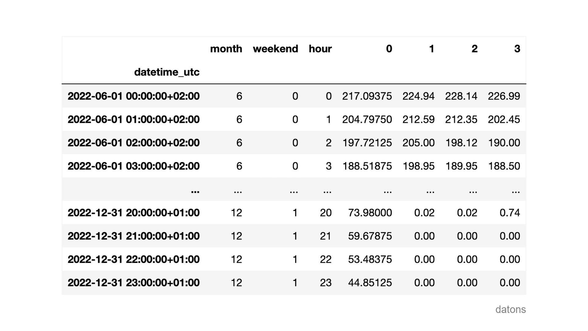
For each hour of a day, the price of electricity is determined by the daily and intraday markets.
In this case, we will explain how explanatory variables influence the detection of anomalous observations using SHAP values.
Questions
- What technique is used to explain Machine Learning models?
- How to interpret SHAP values?
- Why does the same value of
WEEKENDinfluence the model’s result differently? - How to visualize the influence of each explanatory variable in anomaly detection across all observations?
- And in a specific observation?
Methodology
Model for detecting anomalies
We use the Isolation Forest algorithm to detect anomalies in historical data.
from sklearn.ensemble import IsolationForest

model = IsolationForest(contamination=0.01, random_state=42)
model.fit(df)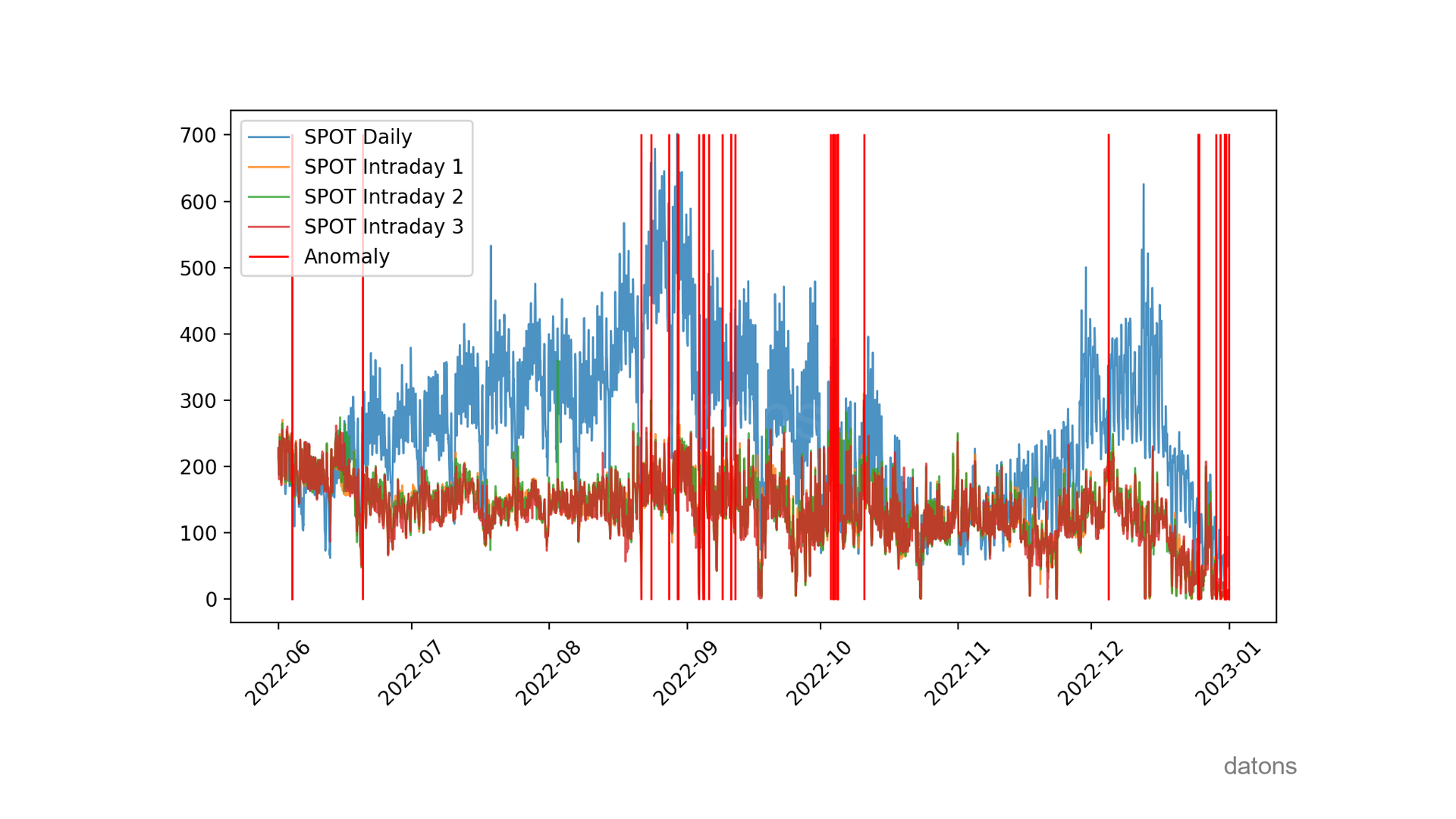
The chart is very nice for seeing when anomalies occur. But beyond visualizing them, we need to explain the influence of explanatory variables in their detection.
Visit this tutorial to learn more about the Isolation Forest algorithm.
SHAP values to explain anomalies
We create an explainer for the model and calculate SHAP values to explain anomalies.
import shap

explainer = shap.Explainer(model.predict, df)
shap_values = explainer(df)
After calculating SHAP values, we visualize the importance of explanatory variables in anomaly detection.
SHAP summary
The price of intraday market 2 is the most important variable for detecting anomalies, with an average absolute influence of 0.3.
shap.plots.bar(shap_values)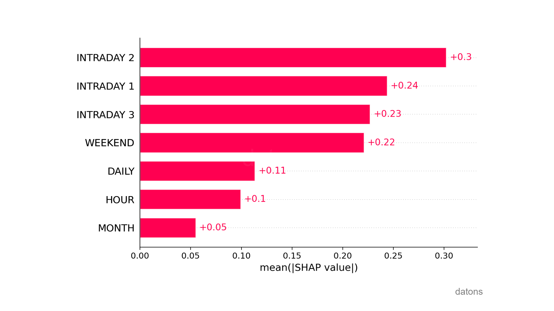
In addition to average values, we can visualize the summary chart to understand the influence of explanatory variables on each observation.
shap.summary_plot(shap_values)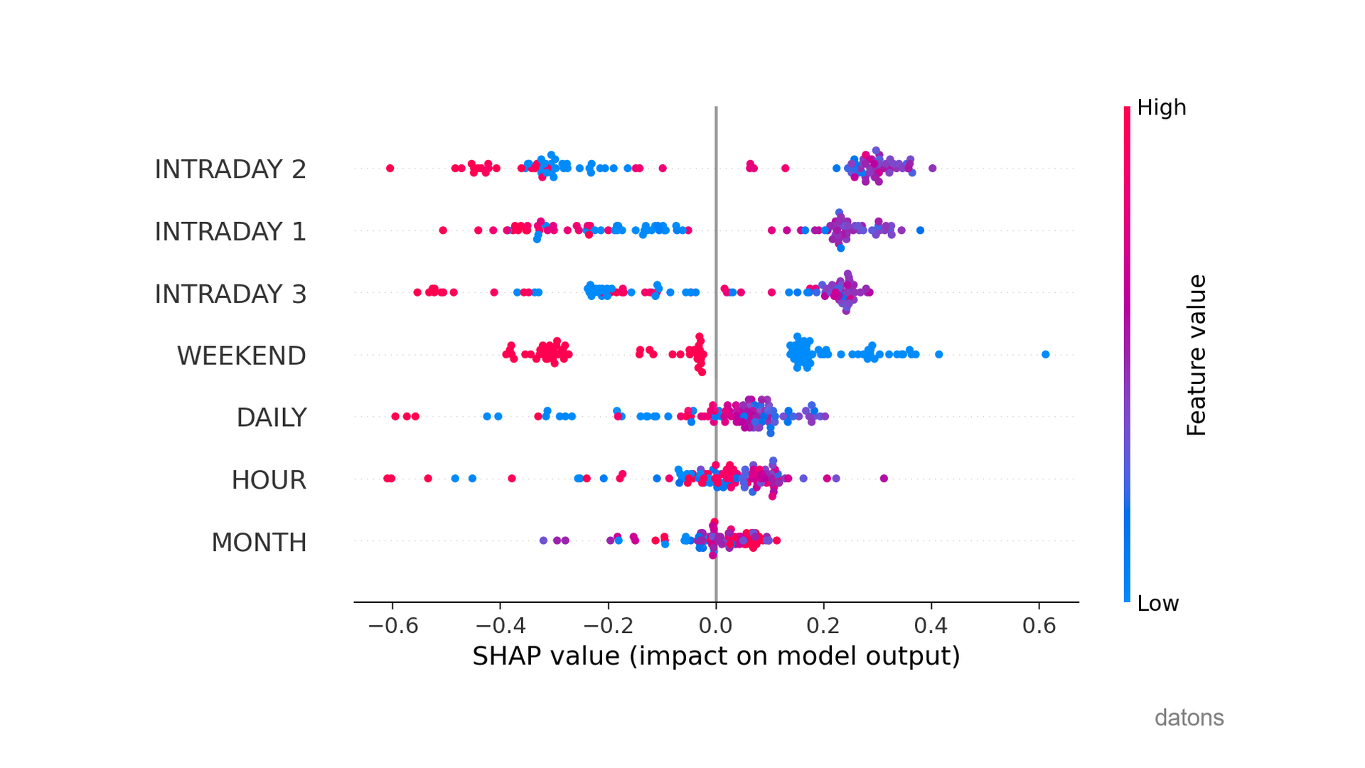
What is most significant?
If we look at WEEKEND, low values (i.e., weekdays) cause the prediction to go to the right, predicting normal observations.
Conversely, weekends (high values in red) make it more likely that observations are anomalous.
What additional conclusions can you identify from this analysis? I’ll read you in the comments.
SHAP in detail
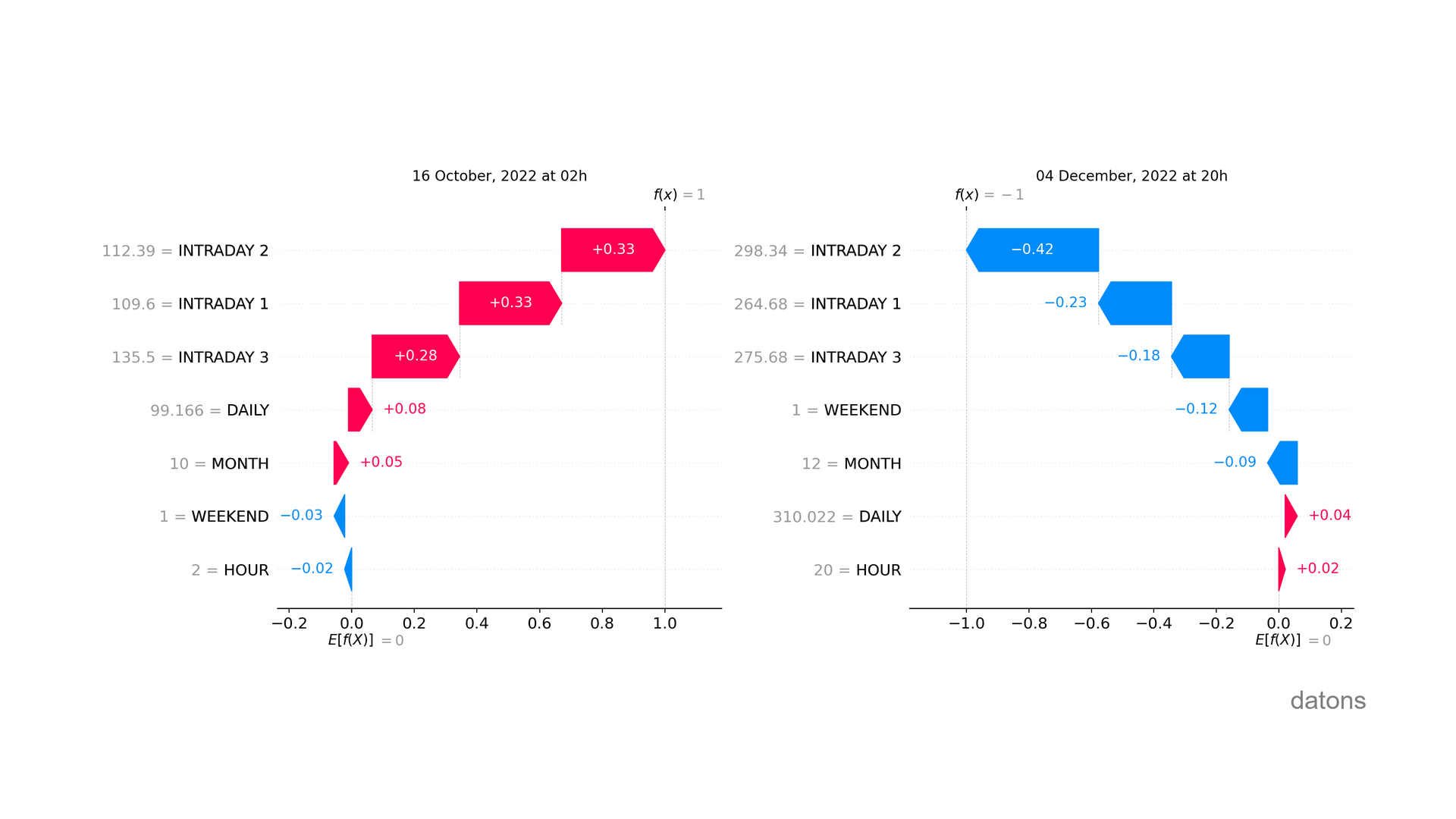
Furthermore, we can analyze the specific influence of explanatory variables on each observation.
shap.plots.waterfall(shap_values[0])As you can see, the influence of the same explanatory variable is not always the same despite having the same value (see WEEKEND).
Remember that Machine Learning models do not follow linear patterns.
Interactive SHAP
Finally, we can visualize the detail of all observations in an interactive chart.
shap.force_plot(explainer.expected_value, shap_values.values, df)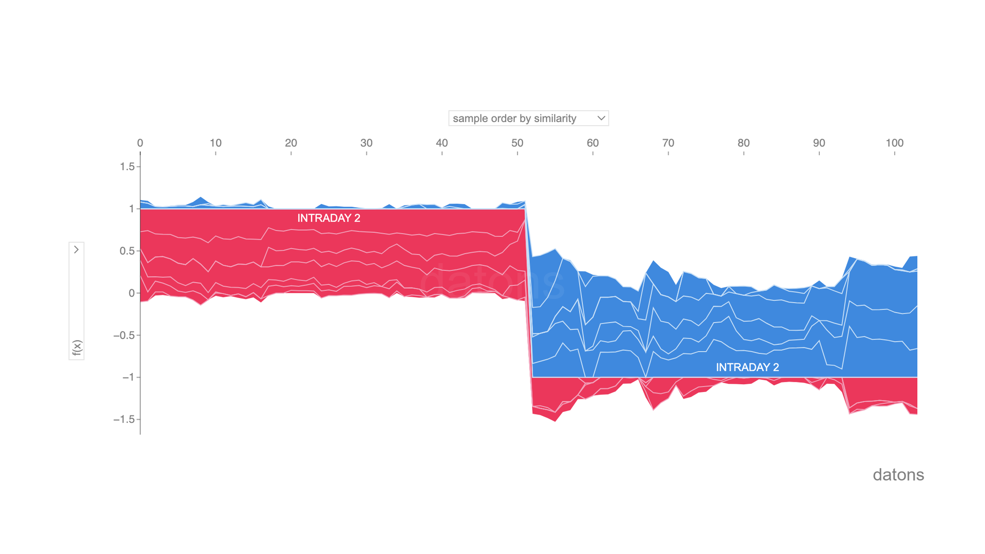
Conclusions
- Technique for Explaining Models: SHAP (SHapley Additive exPlanations) to explain the non-linearity of Machine Learning models.
- Interpreting SHAP Values: How much does each explanatory variable influence the model, on average?
- Different Influence of
WEEKEND=1: When explaining non-linear models, the same value of an explanatory variable can influence the model’s result differently. - Visualizing Influence Across All Observations:
shap.summary_plot(shap_values)shows a ranking of the influence of explanatory variables among all observations. - Visualizing in a Specific Observation:
shap.waterfall_plot(shap_values[0])details the influence per variable in a specific observation.
If you could program whatever you wanted, what would it be? I could create a tutorial about it ;)
Let’s talk in the comments below.
Keep reading
Related articles you might enjoy
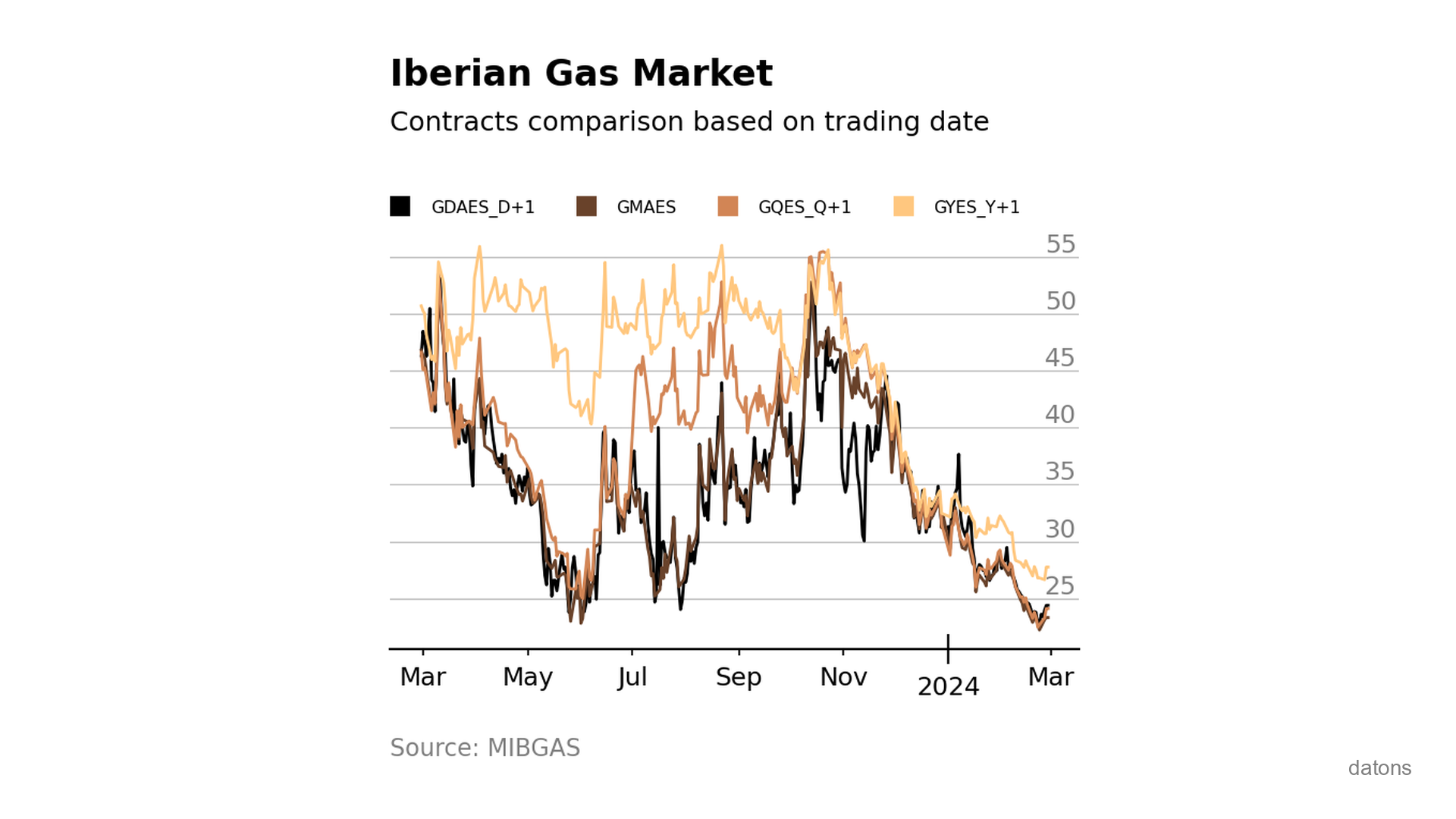
Visually comparing contracts from Iberian gas market MIBGAS
Discover how to analyze and visualize MIBGAS contract prices using Pandas and Matplotlib. This tutorial guides you through data filtering, date handling, and interpolation techniques.
Read
ENTSO-E API in Python: European energy data analysis
Automate your European energy analyses with Python and the ENTSO-E API. We explain step by step with practical examples.
Read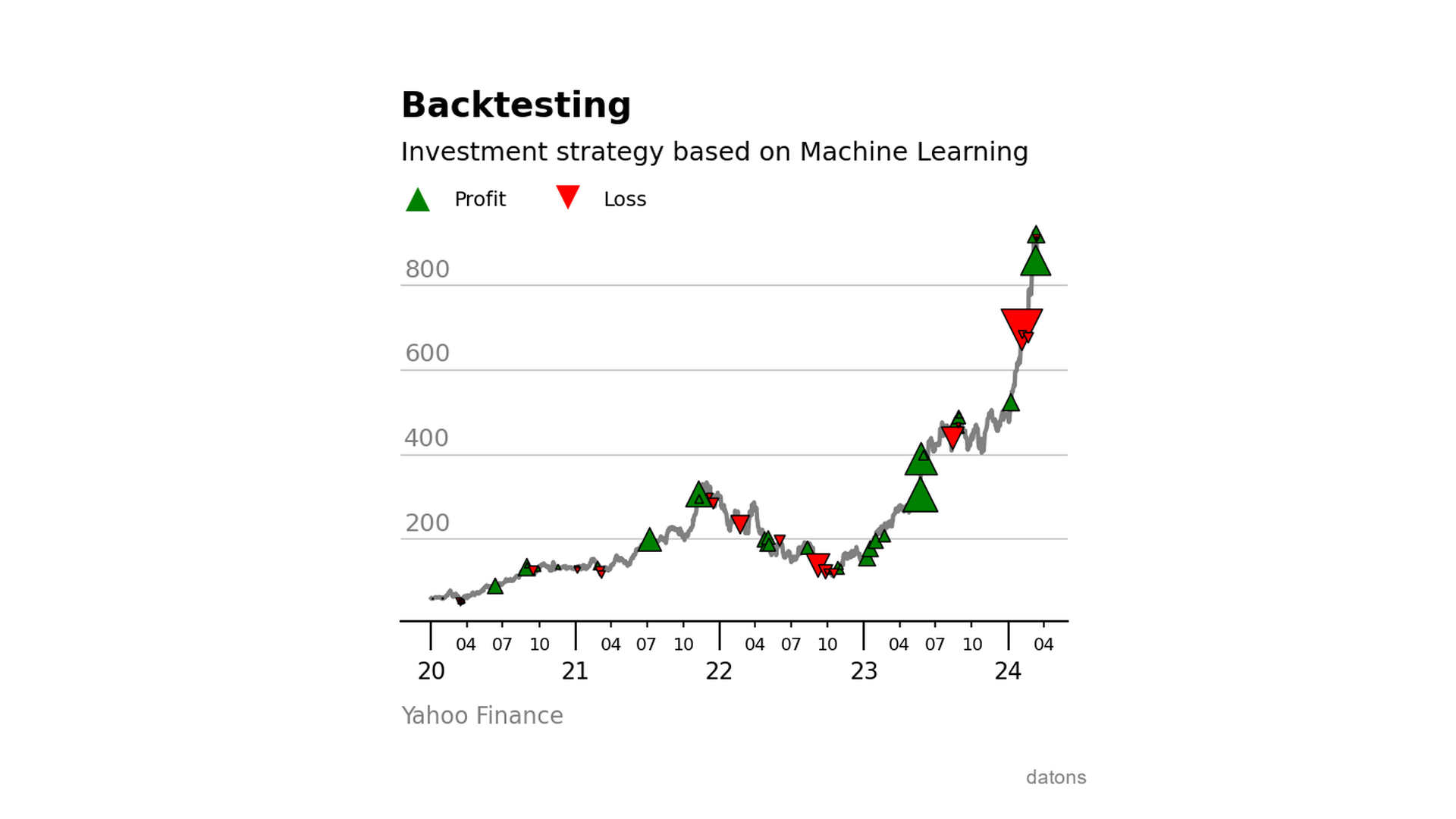
Backtesting with ML-based investment strategies
Learn to integrate a Machine Learning model into an investment strategy and evaluate its performance using the backtesting.py library with Python.
Read