Based on the energy generation bids recorded by EOLICA AUDAX (ADXVD04) in the OMIE market during 2023, this article presents an analysis of anomalies in the time series.
In this tutorial, you’ll learn how to develop an anomaly detection model for time series with Python based on a practical case.
Data
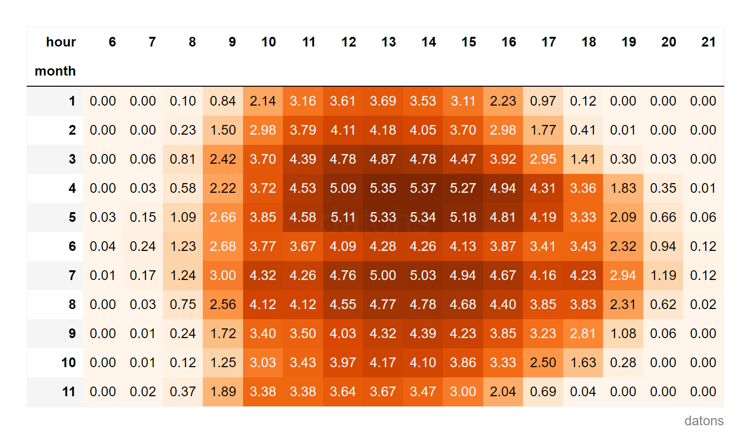
Each row represents the energy that the bidding unit ADXVD04 has recorded in the OMIE market during 2023.
import pandas as pd
df = pd.read_csv('data.csv')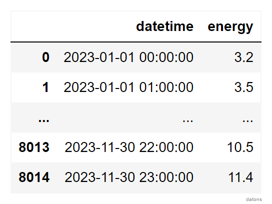
Questions
- How to extract temporal properties to detect anomalies?
- How to use the Isolation Forest algorithm to identify anomalous data?
- How to configure the algorithm to detect a specific percentage of data as anomalous?
- What techniques are used to visualize anomalous data in the time series?
Methodology
Temporal Columns
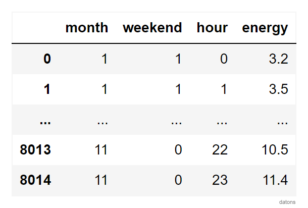
Following the steps of this tutorial, we create temporal columns that could explain the reason for anomalous data.
df.datetime = pd.to_datetime(df.datetime)
df.set_index('datetime', inplace=True)

df = (df
 .assign(
     month = lambda x: x.index.month,
     hour = lambda x: x.index.hour,
    )
)
Anomaly Model
To detect anomalous data, we use the IsolationForest algorithm from the sklearn library. We set the contamination parameter to auto so the model automatically detects anomalous data.
from sklearn.ensemble import IsolationForest

model = IsolationForest(contamination='auto', random_state=42)
model.fit(df_model)
Automatic Anomaly Percentage
Using the mathematical equation optimized by the algorithm, we calculate the anomalous data to visualize the percentage of anomalies.
Would this be interesting to one of your friends? Share it with them.
df['anomaly'] = model.predict(df_model)

(df
 .anomaly
 .value_counts(normalize=True)
 .rename(index={1: 'Normal', -1: 'Anomaly'})
 .plot.pie()
)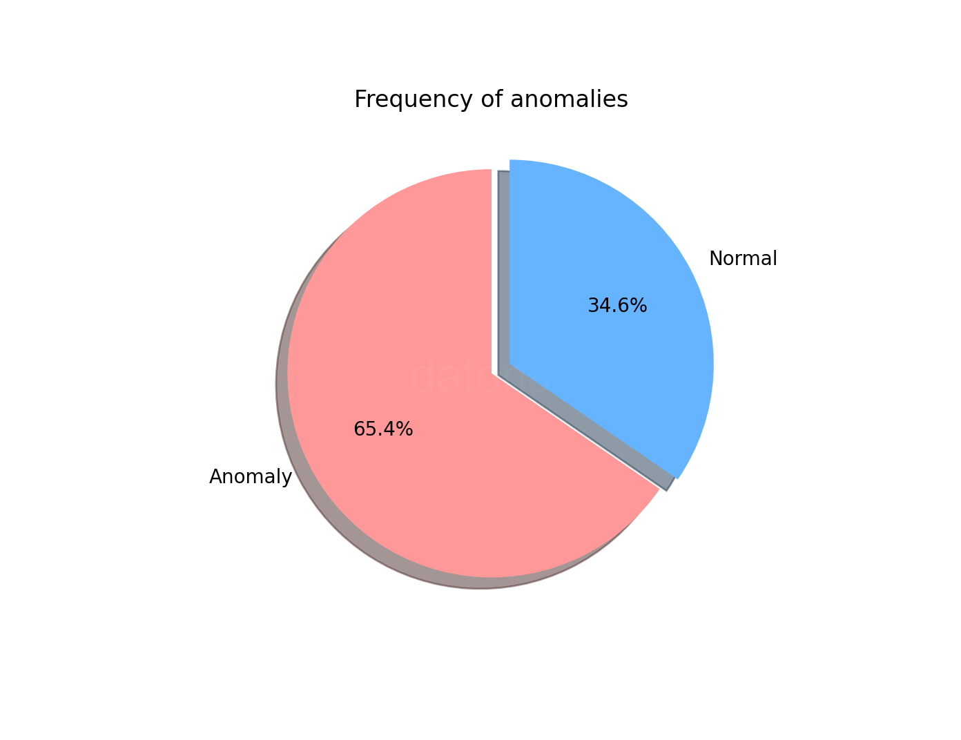
A 65.4% of ADXVD04 bids are anomalous according to the model’s automatic setting.
Specifying Anomaly Percentage
It’s not logical for the majority of the data to be considered anomalous. Therefore, we adjust the contamination parameter to 0.01 so the model detects 1% of the data as anomalous.
model = IsolationForest(contamination=.01, random_state=42)
model.fit(df_model)
df['anomaly'] = model.predict(df_model)
Visualizing Time Series with Anomalies
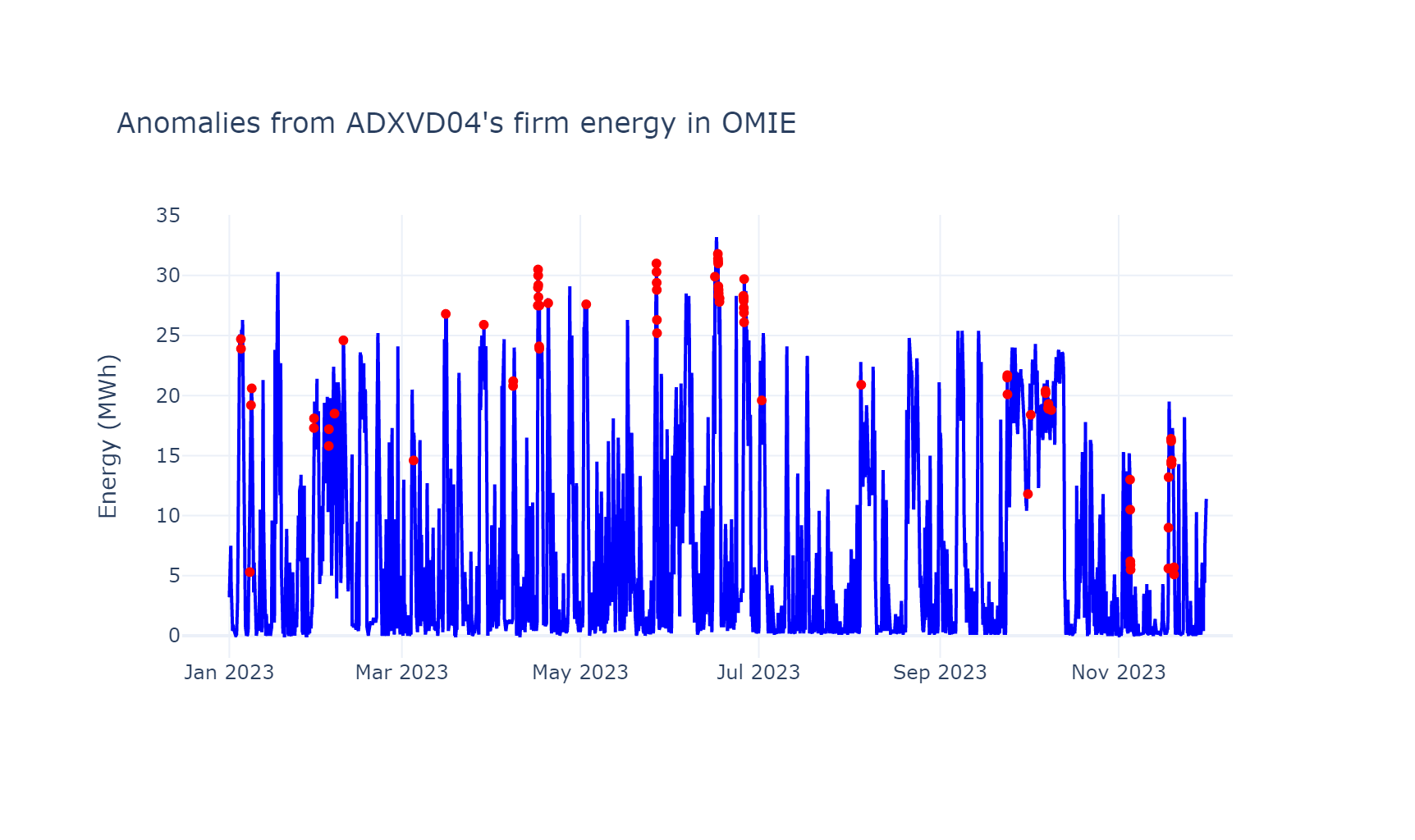
Finally, we select the anomalous data:
s_anomaly = df.query('anomaly == -1').energyAnd visualize them with points on the original time series using the graph_objects sublibrary of plotly.
import plotly.graph_objects as go

go.Figure(
    data=[
        go.Scatter(x=s_anomaly.index, y=s_anomaly, mode='markers'),
        go.Scatter(x=df.index, y=df.energy, mode='lines')
    ]
)We can observe that the model detects anomalous observations, especially in the peaks of the time series.
What else could we do to analyze the anomalies? I’m looking forward to your comments.
Conclusions
- Extraction of Temporal Properties:
df.assignto createmonthandhourcolumns from theDatetimeIndex. - IsolationForest Algorithm:
sklearnincludes this algorithm in its Machine Learning framework. - Model Adjustment for Specific Anomaly Percentage:
IsolationForest(contamination=0.01)adjusts the model’s sensitivity to identify 1% of the data as anomalous. - Techniques for Visualizing Anomalous Data:
plotly.graph_objects.Figureallows us to combine in a visualization both the anomalous data and the original time series.
If you could program whatever you wanted, what would it be?
I might give you a hand by creating tutorials that help you. I’ll read you in the comments.
Keep reading
Related articles you might enjoy
Working with temporal properties using pandas Datetime Index
Leverage the properties of DatetimeIndex in Pandas for more efficient time series analysis, from formatting the column to creating reports with pivot tables.
Read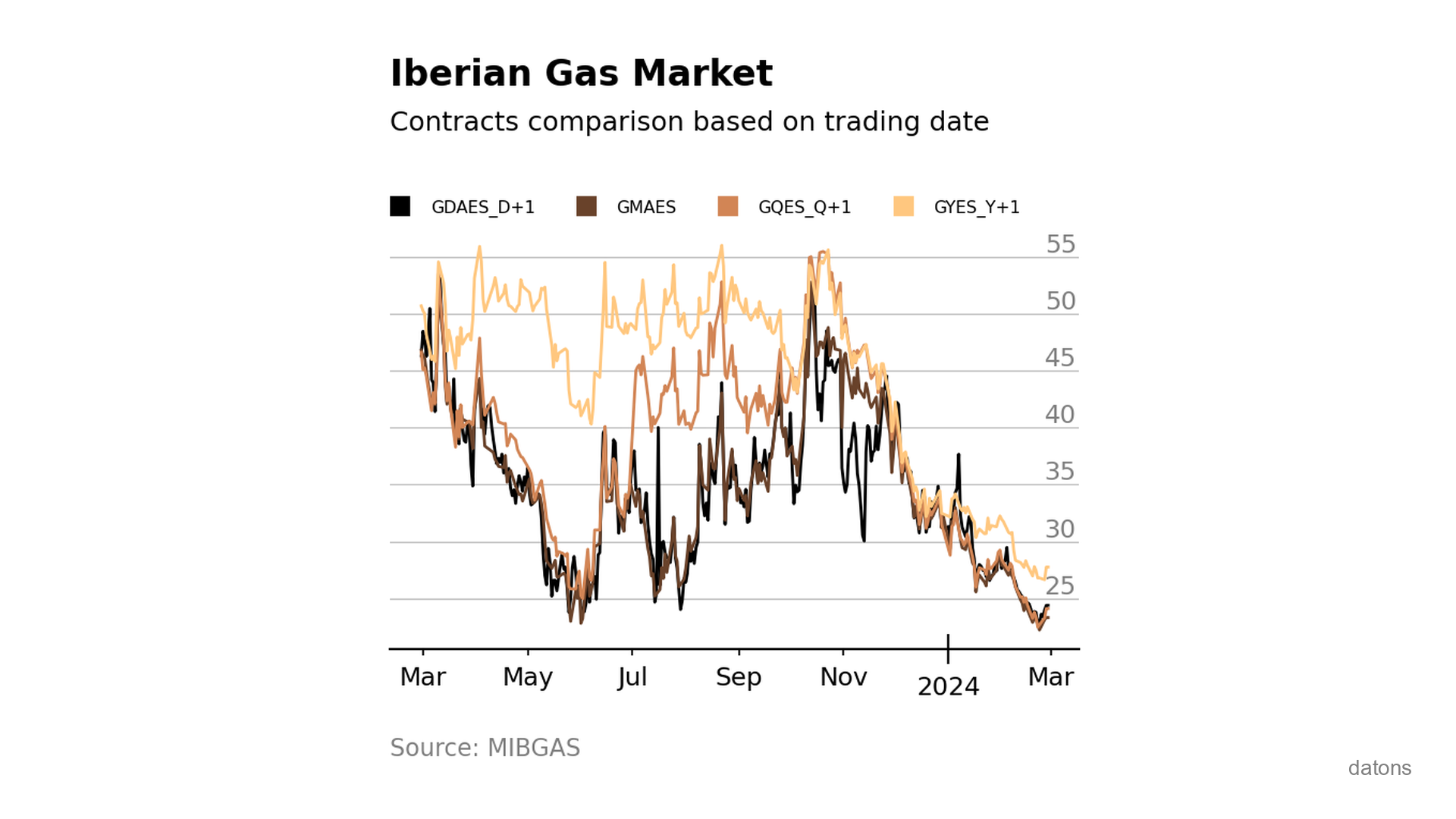
Visually comparing contracts from Iberian gas market MIBGAS
Discover how to analyze and visualize MIBGAS contract prices using Pandas and Matplotlib. This tutorial guides you through data filtering, date handling, and interpolation techniques.
Read
Main differences between matplotlib, seaborn, and plotly
Which library should you use for data visualization in Python? Matplotlib, Seaborn, or Plotly? Learn the main differences between them and when to use each one.
Read